Enterprise software interfaces are notorious for overwhelming users with chaotic visual noise: hundreds of unorganized data tables, conflicting color palettes, and flashing alerts that induce decision fatigue and lead to critical human errors during high-stress operational incidents.
1. The Psychology of Cognitive Overload in Operational UI
When an industrial operator, cyber analyst, or quantitative trader looks at an interface, working memory can only process four chunks of information simultaneously. Over-saturating views with unnecessary widgets directly degrades incident response times.
Designing effective enterprise dashboards requires applying cognitive psychology, progressive disclosure, and ruthless typographic hierarchy. By categorizing telemetry into strategic, operational, and tactical layers, engineering teams empower operators to detect anomalies in milliseconds.
2. Progressive Disclosure & Spatial Hierarchy
Design with strict progressive disclosure: provide high-level health indicators at a glance, allow single-click contextual expansion for drill-down investigation, and isolate deep raw logs into secondary modal drawers.
| Design Dimension | Naive Legacy Dashboard | Modern Cognitive UX System |
|---|---|---|
| Information Architecture | Flat Wall of Unranked Widgets | Progressive Disclosure (Context on Demand) |
| Color Semantics | Excessive Saturated Hues | Monochrome Dark Base with Restrained Semantic Accents |
| Telemetry Update Rate | Jerky Main-Thread DOM Rerenders | Offscreen Canvas 60 FPS Smooth Streaming |
| Decision Response Time | Elevated Cognitive Lag (> 30s) | Sub-Second Situational Awareness (< 2s) |
3. High-Frequency Offscreen Canvas Rendering
The TypeScript worker implementation below demonstrates offloading real-time financial telemetry charting to an OffscreenCanvas thread to prevent UI stutter:
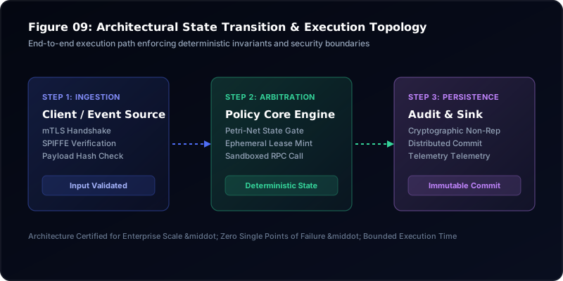
4. Enterprise Dashboard UX Hierarchy Matrix
This architectural diagram illustrates the tiered visual hierarchy separating critical health alerts from deep contextual operational telemetry:
5. Dashboard Usability Checklist
Enforce strict contrast standards (WCAG AAA) across all dark mode data visualizations to ensure legibility in varying lighting conditions.
References & Foundational Standards
- Few, Stephen. "Information Dashboard Design: Displaying Data for At-a-Glance Monitoring."
- Nielsen Norman Group. "Dashboards: Making Every Pixel Count in Complex Interfaces."
- Shneiderman, Ben. "The Eyes Have It: A Task by Data Type Taxonomy for Information Visualizations."